1
HOME > Trends >
WHY PURPLE IS THE SHADE FOR SS17
THE UNDER-THE-RADAR “IT” COLOUR OF THE SEASON
Written by Ivan Yaskey in Trends on the 12th July 2017

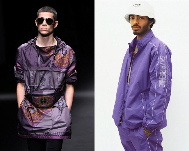
How much royalty can you have? With Spring/Summer 2017 collections pointing you toward a conclusion, it’s a whole bunch – but only in selective, concentrated amounts. Purple – more of a darker violet or Tyrian shade than lavender or mauve – made its presence felt through what can best be described as spotty ubiquity: A little here from a windbreaker or suit jacket or just a hint through a pattern, and by the time you’ve reviewed everything, you’ve noticed it in small dots and splotches everywhere.
Because of this, purple is SS17’s under-the-radar “it” shade. Unlike pink and aquamarine, this more feminine-leaning colour hasn’t entirely found its foothold until now. As part of the reason behind its lack of staying power, the shade isn’t a bona fide warm tone – too much dark blue – but with just enough red, it’s too bold and striking to be on par with navy and other mundane cooler colours. Stuck in the middle, it reminds you of an old history class lecture on how ancient Phoenicians and eventually the Romans made this sought-after dye, and once you’re going about your business, it rarely surfaces – except, maybe, as one of many shades involved in a paisley or floral print. In short, you don’t wear purple because you almost never think about it. Yet, for the following reasons, this season shows that it’s no longer going to be in the background:
It’s Familiar
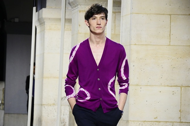
In 2014, jewel tones introduced the concept of brightness with depth to menswear’s colour palette. Although certain shades, such as emerald and ruby red, have since fallen out of favour, burgundy has remained precisely for this reason. It’s a shimmering pop without appearing overly so. From this foundation, purple in its darker forms emerges. With burgundy’s reddish tint scrubbed out, leaving only dark purple as a result, the colour exudes richness, still has the boldness of gem tones, and has an almost smoldering quality to it without too much fire.
The Right Juxtaposition
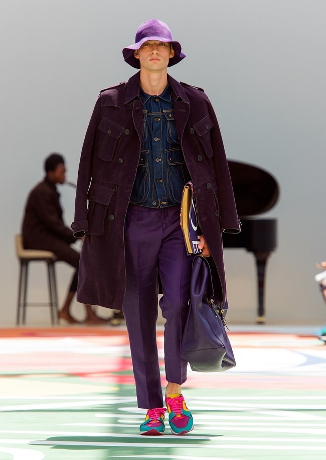
If SS17’s trends mark a turning point, it’s this: While some seasons move backward into the comfortable, neutral territory of olive drab, khaki, and navy, others forward menswear’s movement into the bolder, brighter territory of colour infusions. Bright yellow signified a clear progression, while pale pink and pastels both simultaneously expanded and muted it. Where does a shade like royal purple fit into this shift? Compounding to its familiarity, the colour has found two niches: One, it’s a bluer version of redder hues, and secondly, it adds a reddish infusion to navy and denim shades. In essence, it’s a different kind of blue and a variation on dark red: Like jeans or workwear dipped briefly in red dye, or a lower-key, less-intense version of burgundy, still with statement-making influence.
Lots of Versatility
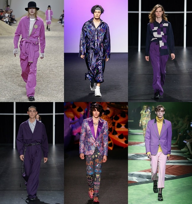
With select shades seen as more novelty choices such as Marsala, wearing them comes with limitations. Fortunately for purple’s longevity, those are few. Rather, based on Versace’s, J.W. Anderson’s, and Hermes’ SS17 runway presentations, purple commonly surfaces in solid form, which means it functions well as both an accent shade and as a colour-blocking agent. Within these two contexts, darker purple hues pair well with neutrals – white, black, and even tan – acting as a pop of colour without overshadowing everything else. Yet, its less-frequent usage turns it into a visual draw; as such, it makes sense when used for a single piece, such as a blazer or button down, but adds too much saturation when applied to a full suit.
You’ve Got Skills
Until fairly recently, purple came with tacky, overly flashy connotations: A shade associated strangely with pimps, ‘80s androgyny à la Prince, and pickup artists attempting to “peacock” at a nightclub. Yet, its recent turns on the runway make it more accessible. As a result of its earlier impressions, successfully pulling off purple is one way to show you’ve got some serious style skills. While certain colours naturally come together, purple can easily seem like the odd one out or blow everything out of its path. The trick, then, is understanding that, in several contexts, a little goes a long way, and when you’ve got it just so, its brilliance draws attention for all the right reasons.

Ivan Yaskey
Philadelphia’s streetwear scenes and working as a copywriter for a Boston-based menswear brand sparked Ivan's passion for fashion and style more than a decade ago.


Trending
2
3
4
5
6
7
8
9
10


