1
HOME > Trends >
A GUIDE TO TRYING OUT THE TWO-TONE MENSWEAR TREND
Written by Ivan Yaskey in Trends on the 24th March 2020
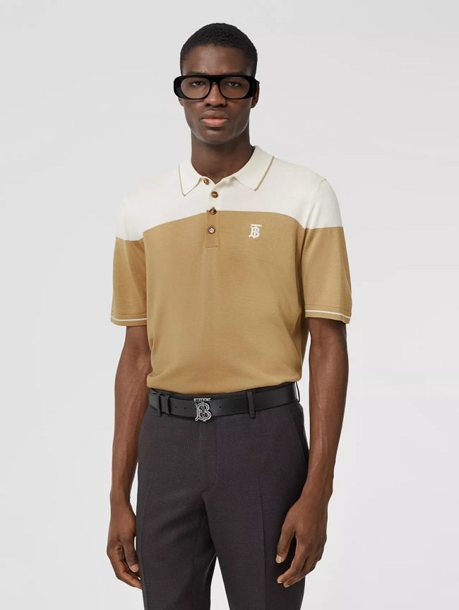
Colour-blocking, at least in recent memory, isn’t a new concept. In fact, either with how you put together individual garments or wear single pieces, we all do it to some extent. As with many menswear trends, what starts interesting – and revisited, considering colour-blocking’s popularity in the ‘80s and ‘90s – becomes ordinary. There’s nothing adventurous in it, and even the least style-competent can handle it. Boundaries get pushed, as do expectations. Concepts and execution evolve, and what manifests presents yet another challenge. The successor – or, more appropriately, complement – to classic colour-blocking appears to be the two-tone variation – also called “divided” or bicolour. The name – whichever one you give it – is apt: A strong line, with little to no paneling – divides the garment nearly always strictly in half. It appears mathematical, but also like a crude home-ec project of sewing two different garments – like, say, a linen white suit jacket and a black blazer – together into a single piece.
On this last note, the mixed-media aspect plays one factor: Not only should the garment feature two strongly contrasting shades – black and white dominate, but plenty more variations exist – but the textures between the two halves ought to vary, too. As you one-up your game – and, let’s face it, we haven’t fully given colour-blocking a second thought within the past year or two – here’s how to attempt this two-tone trend.
Find the Dividing Line
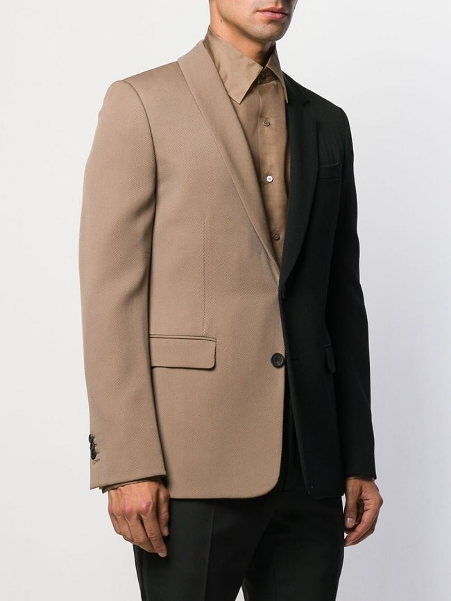
Is it horizontal or vertical? Does it go along the diagonal? The most definitive feature of this trend is a single dividing line that splits the garment nearly right down the middle. The result creates two distinct portions – one that’s clearly dark and one significantly lighter. We’re spotting more vertical lines, as if you took a ruler, drew a line down the centre of your trousers, blazer, or shirt, and coloured in the other side with a permanent marker. Diagonals – adding a sense of asymmetry without throwing off the garment’s full visual alignment – come in a respectable second place. The key element here is giving your garment a strict linear feeling. Plenty of colour-blocking efforts look like a geometric puzzle – not that there’s anything wrong with that – of multiple colours and shapes methodically pieced together. As well, there’s often a clear absence of symmetry. With this point in mind, the garment shouldn’t look too grid-like – or as if you just designed architectural plans on your shirt – and should be based around symmetrical design – whether on the dividing line or bisecting it at a 90-degree angle.
Don’t Be Subtle
Colour-blocking efforts generally fall into one of two groups. The extreme end seeks out all possible contrasts and shoehorns in as many colours as can possibly fit, before the fabric itself evolves into a pattern. The second is merely suggestive: tonal, faint, and with mere hints at its desired colour scheme. The result, for this past group, seems restrained, as if something’s being held back. Divided colour-blocking falls somewhere in between. The contrasts need to be obvious, but it shouldn’t be too complicated, with too many elements vying for attention. Yet, it shouldn’t require intense studying: Its two-sidedness ought to be more apparent than wearing a reversible garment with the cuffs or lapels turned outward to imply a contrast. On this last note, ombre, even with two shades, isn’t a true divided combination, as it quite literally blurs the line in between and has more of a gradient, gradual transitional effect. From this point, you can call it a day – after all, splitting your garment visually down the middle might be all the adventurousness you need. Or, you can push it a little further, depending upon your limits: Overlay a pattern on top – we’ve seen pinstripes as one possibility – or dabble with various textures to make its two-sidedness (and two-facedness, if you prefer) more apparent.
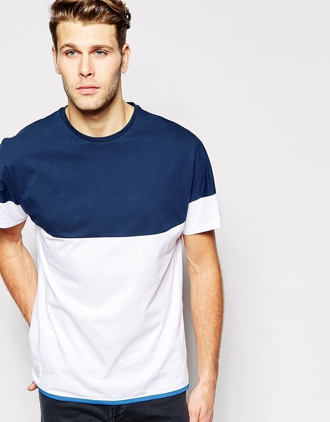
Colour-Blocking Never Exists in a Vacuum
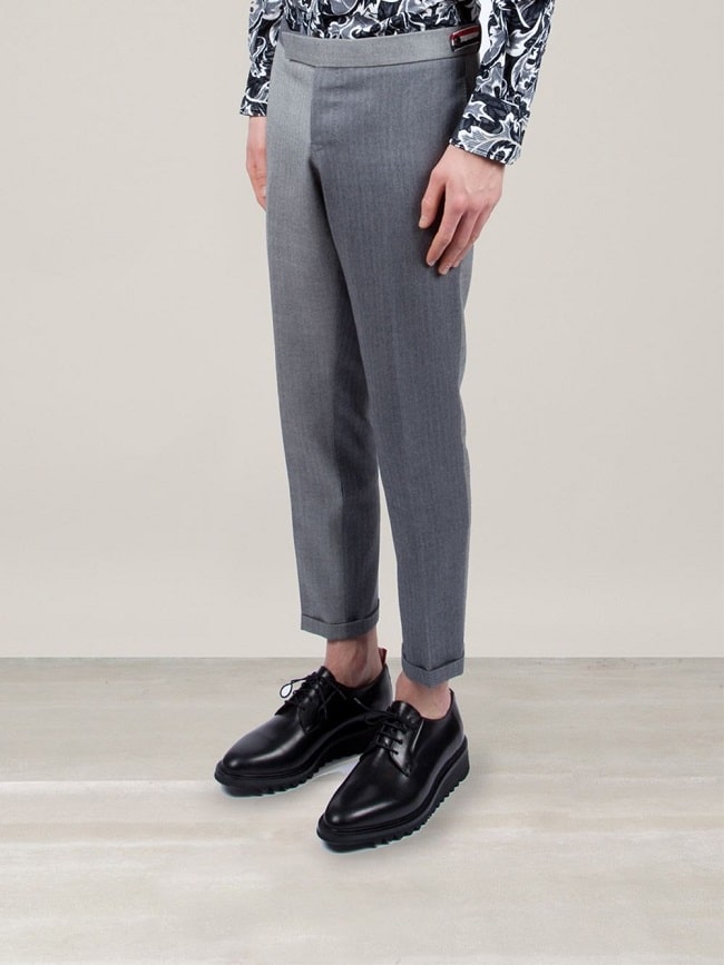
The problem – or the trick you’ve got to figure out – with paneled, geometric colour-blocked garments is understanding its role in and relation to the rest of your outfit. You can have too many ingredients, and as anyone who’s ever tasted an over-spiced dish knows, it’s certainly not pleasant, with both a harshness and lack of focus hitting your taste buds at the same time. You try a bit, and then push your plate away – it’s just too much. With divided two-tone menswear, you want to keep things simple, both in terms of the colours you select and where you think about angles. Firstly, keep the colours to two at minimum – with one shade borrowed from the divided garment – or go for what’s being dubbed the “Neapolitan” look after the popular ice cream combination – throw in a third that either relates to the other two or stands out on its own. If, for instance, you’re starting with black and white, grey offers a safe and tonal third, while bright blue or green adds that strawberry-esque contrast.
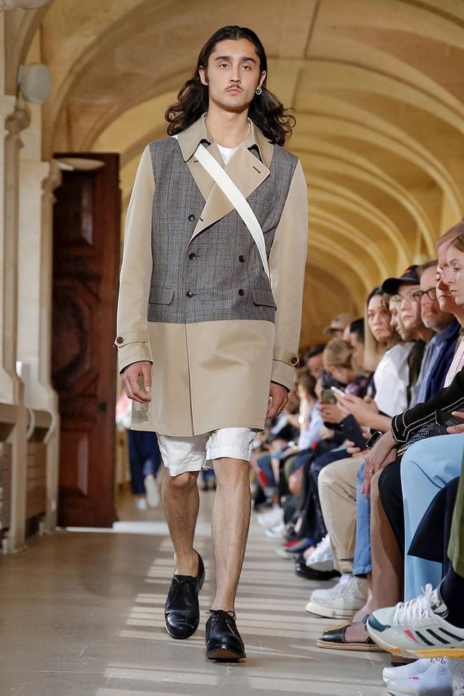
Don’t Forget About Accessories
Designers definitely haven’t. Converse – both as of recent and during their history – has released various divided and paneled colourways, and their higher-end models have returned to this familiar spot. However, bicolor footwear doesn’t always have a clear dividing point: Rather, it veers deep into paneled territory, with material around the heels, collar, and for any wing tips and brogue details featuring a contrast shade. Similarly, divided or bicolor menswear has indirectly revived the two-tone watch, which, during its 1980s heyday, featured a mix of gold and silver down the band – in a distinctive two-tone colour-blocked pattern – and on the watch face. Today, you’ll still spot this mixed-metal combination, but mixed golds – rose and yellow – or steel with rose gold adapt this blend to the modern man’s more refined tastes.

Trending
2
3
4
5
6
7
8
9
10


