1
HOME > Trends >
KEY COLOURS FOR AUTUMN/WINTER MENSWEAR COLLECTIONS
Written by Ivan Yaskey in Trends on the 4th November 2020

Autumn represents a transitional period in fashion and your wardrobe. It’s a season of layers and thicker materials, of throwing on a light jacket over a long-sleeve shirt to go outdoors. In most of the world, that puffer or thick wool peacoat only comes out midway through December, and until then, heavier cottons in the form of corduroy and tweed have you covered. Yet, while autumn marks a shift globally, it’s a season quintessentially intertwined with the Northeastern U.S. Vast sections of trees, often over rolling hills and mountains from New York state into Maine and even as far down south as the Carolinas, see their leaves change from a crisp, verdant green into warm reds, oranges, and yellows. Leaf-peeping, strictly for the visuals and, as of a decade ago, for the ‘Gram, becomes a thing for roughly a month.
Then, it’s all gone. The trees shed their leaves, now a medium brown, where they gather on the ground, either to decompose or, across many Northeastern properties, be swept up and relegated to the compost pile. The shades listed here embody autumn colours in a completely earnest, subtext-free sense. A fashion designer can attempt to force some pink or even green in, but it reads as an out-of-bounds novelty shade. With AW20 collections signifying a back-to-basics approach, it’s only logical then that colours reflect this pattern’s predictability.
Cream
Off-whites look like fallen leaves, albeit from a more pallid perspective. The infusion of more almond tones lessens the severity of bright, solid white, which, especially with the current trend of doing head-to-tone monochrome, can come off as too much of a good thing. The result is softer, doesn’t read as “white,” and has a light earthiness to it.

Linder
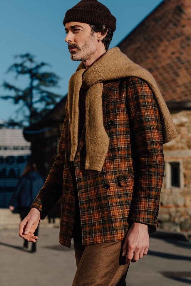
Browns and Earth Tones
Earth tones can’t quite shake their ‘70s granola reputation. Outside of this period context, they’re visually peak autumn, especially the brief interval as summer’s greens transform into rich reds, yellows, and oranges. Still, the tones aren’t saturated and have an almost dirty, ruddy quality to them, giving way to tan, coffee, and chocolate brown shades. On and off throughout the history of menswear, brown rears its head as a neutral shade, and this season, we can confidently say it has made a return.

Reese Cooper
Muted Reds
When we picture red, it’s the crayon shade – bright, incredibly specific, and filled with a particular fire. But, red as a spectrum doesn’t begin and end here. Some say it starts with the purple- and brown-flecked depths of burgundy, makes an arch through orange-tinted brick shades, and then ends on the other side with a an almost blood colour – with hints of black swirling around to undermine its intensity. AW20’s reds encompass that crayon colour, but stray far past in either direction. This degree isn’t particularly flattering on anyone, unless you use it in small doses, but a dusty brick shade appears more as an orange-brown – a different take on a neutral essentially and one that pairs well with the cream tones we described above. Blood red has an almost punkish, counterculture quality to it, where it doesn’t matter how well the colour flatters – it’s shrouded in mystery and secrets. This season, Pantone describes this spectrum as Fired Brick to a sultry yet enthusiastic Samba.

Berluti
Amber
You could file amber under earth tones for its tan-tinged patina. Or, in the tradition of adapting luxury to everyday wear, its muted gold body grabs attention without being showy. Patone is properly calling this shade “Amberglow” for its invigorating, almost fiery orange notes that project one’s self confidence and show you’re not afraid to express yourself. As an in between colour that reflects autumn’s transitional nature, amber is part jewel tone, mimicking the bold, smouldering stones you’ll see in a jewellery store, perhaps popping against a silver setting, yet hasn’t strayed far from its tan-orange foundation. However you want to spin it, amber appears like autumn without reeking of pumpkin spice, and its versatile, almost two-faced nature positions it as both a highlighting shade in the same vein as yellow and a self-sure solid like tan or brown.

Todd Snyder
Pink
Pink, as we’ve covered, isn’t so much of an AW20 shade as 2020’s most ubiquitous menswear colour. The dropping of the temperatures and shortening of the days haven’t dulled its intensity. For autumn, spring and summer’s light, wispy blush-meets-peach diverges down two paths. One is Rose Tan, simply a darker, dustier version that throws a hint of brown into the mix to turn a traditionally statement shade neutral. It’s still soft, though, and almost rosé in tone and works with both solid and textured materials, like velvet and knits. The next shift is fuchsia, essentially watermelon given an electrified, hyped-up appearance with a splash of classic red thrown in for good measure. Fuchsia – the colour of Mickey Maguire’s limo in Shameless, played for camp then but now an upgrade to the shade introduced in Harry Styles’ “Watermelon Sugar” video – pulls from the vibrancy of other traditionally autumn colours like red and even orange yet refuses to blend in. It’s as if statement colours have been taken up a level, challenging future collections to handle it with both finesse and caution.

Tom Ford

Ivan Yaskey
Philadelphia’s streetwear scenes and working as a copywriter for a Boston-based menswear brand sparked Ivan's passion for fashion and style more than a decade ago.


Trending
2
3
4
5
6
7
8
9
10


