1
HOME > Trends >
WHY MENSWEAR IN 2021 IS ALL ABOUT NEUTRALS
Written by Ivan Yaskey in Trends on the 29th March 2021
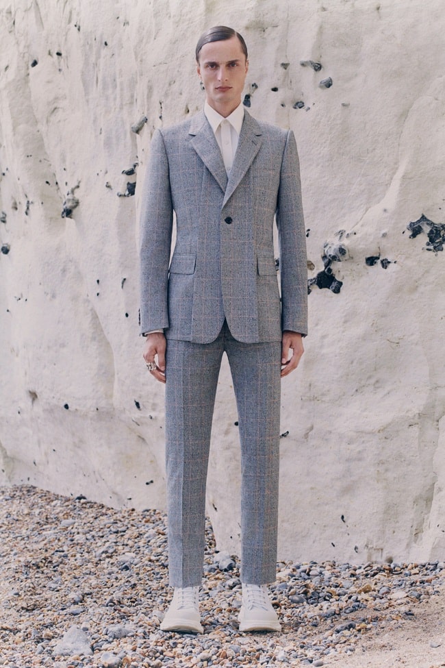
If you keep track of colour trends, each year since the early 2010s has promised something bigger, bolder, and brighter. Pink rears its gender-bending fluffy head periodically, and we’ll spot purples, in degrees from lavender and mauve to burgundy, evolving in some form along the masculine-feminine dichotomy. Then, there are the unisex-perceived shades: yellows from highlighter to curry powder, oranges with brick undertones, and reds reminiscent of blood, sandstone, or maraschino cherry in any given season. Woven amongst this are earth tones, emerging a few years ago through renewed interest in 1970s-era fashion and remaining as secondary neutrals through understated yet still rich browns and greens in varying amounts of saturation. Underneath it all resides the neutrals. Can you even call them a trend or a shift, if they’re simply present, being reliable although essentially functioning as dependable, unexceptional filler? Logically, no, but with 2021 beginning, their growing ubiquity – now more of a presence than an undercurrent – challenges that notion.
What Constitutes a Neutral in 2021?
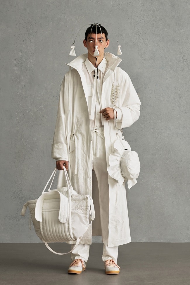
Pantone’s colour trend report illustrates a clear demarcation between the adventurous and traditional, with greater emphasis placed on the latter this year. In the former camp are the vibrant neon and saturated hues – the reds and yellows promised to us in digital Fashion Week presentations last year – along with pastels – now feeling like the new neutrals – and pink in varying degrees of lightness and intensity. Balancing this is a cadre of traditionally neutral hues roughly two years ago no one would have given a thought to. The most prominent – and perhaps most timely named – is Ultimate Grey, symbolising dependability, according to Pantone’s assessment, and unity at the same time. Essentially, it serves as an anchor to the other Colour of the Year – Illuminating, another appropriately named shade that’s nothing more than an understated buttercup yellow. For spring, blues are having their moment, in the form of the powdery and somewhat periwinkle-inflected Cerulean, and navy-hinting French Blue – the colour of photographer Bill Cunningham’s signature utility jacket – and Inkwell, a deeper, darker interpretation. Rounding this out are dusty, sage-like greens, an offshoot of those forest-based hues we’ve been seeing over the past few years. Green Ash runs more pastel, while Olive Branch adds a bit more intensity and provides a lighter take on a traditional military hue. Then, there are the off-white shades. Although not novel to 2021 and, in fact, creating a less-concentrated presence than solid white, this year sees Buttercream and Coconut Cream gain prominence through subtle hints of beige and yellow mixed in, giving them almost a desert character. As the final noted neutral, browns deliver an earthier, more retro alternative to slick black. Pantone’s Spring 2021 hue is dubbed Root Beer, for its herbal, bark-like qualities.
Why We’re Seeing More Neutrals Now
Menswear itself isn’t regressing, nor is it taking a less-innovative, lazier path. Instead, we’ve noticed a combination of the following:
Classics and a Back-to-Basics Approach
Although both aspects might appear synonymous, they’re separate developments that intertwine at points. Classic silhouettes tend to arise out of periods of economic decline – think heritage menswear emerging toward the end of the Great Recession. Yet, the current styles we see – think double-notch Cuban collars, pleated, higher-waist trousers, and an abundance of knits, including sweater vests – didn’t suddenly emerge last year. Rather, their popularity is due to a couple of factors: fascination with the ‘80s and ‘90s, during which ‘50s and ‘60s silhouettes were reworked, and greater attention being paid to minimalist menswear, both in regards to the versatility and longevity of one’s wardrobe and the sustainability issues surrounding drops and fast fashion. Back-to-basics styles, meanwhile, overlap with these aspects yet have emerged from the limited wardrobes many of us have sported during quarantine, resulting in increased demand for athleisure and loungewear. You can see it in how trousers and suits are designed – wider and more spacious, perhaps with a drawstring or a waist with some give. What does any of this have to do with colours? Excluding all the bold, Hawaiian-esque prints on rayon Cuban collar shirts, a basic isn’t truly a basic unless it’s in a more versatile hue like navy, grey, or white. Otherwise, the garment, no matter how classic in appearance, simply becomes a symbol of its time.
More Pastels
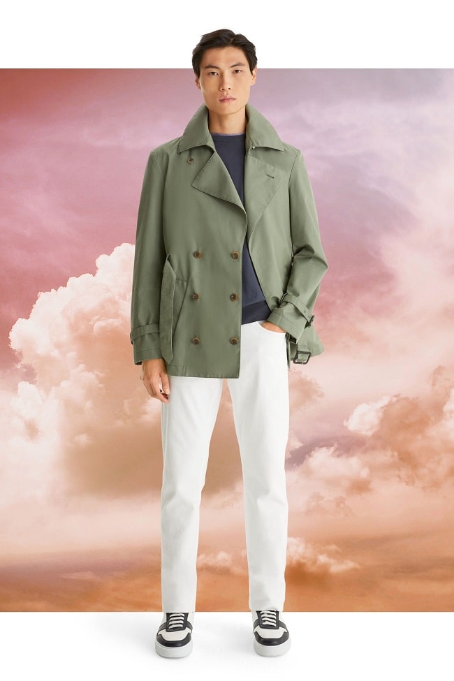
With their toned-down, somewhat darker, almost desert-like nature, pastels have become the new neutrals. These aren’t sprightly, invigorating shades meant to signal the start of warm weather. Instead, they appear as if they’ve been through the wash a few times, so that their former brilliance is now somewhat understated. As a secondary factor, all of the lilacs, lavenders, peach-pinks, aquamarines, and butter yellows are being offset by brick-hued reds and oranges and dustier browns and charcoals, giving you a more comprehensive range of choices. Although you can find plenty of head-to-toe pastel ‘fits out there, this group of hues only truly works with itself and neutral tones. Saturated, jewel tone, neon, and warmer shades, plus solid black and white, all feel as if they exist in a different universe than whatever pastel they’re paired against.
They’re Easier to Layer
Unless you want to look like a pile of laundry, layering random patterns and bright shades on top of each other results in a lack of coherency. Tying into more back-to-basics styles, clothing that can be easily worn together – from sweaters that pull over a button-down for warmth to T-shirts and shirt jackets or even a hoodie under your overcoat – ensures you always have the right combination ready to go without appearing painfully mismatched.
They’re Utilitarian
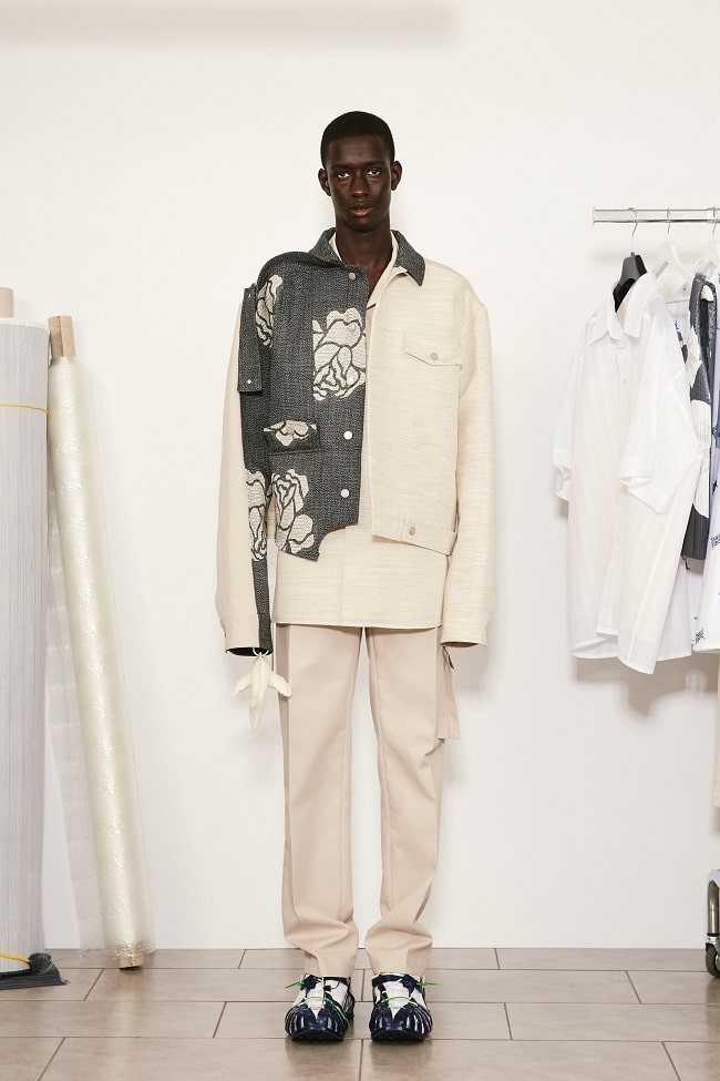
First, it was field jackets. Then, there was gorpcore. Now, everything you can think of – shirts, jackets, and trousers – comes with extra pockets. As a byproduct of this shift, cargo trousers – a staple of the late ‘90s – have experienced a revival, and with them and other utility styles comes the spectrum of military and outdoor shades along the lines of olive, tan, and grey.
Neutrals Equal Longevity
Many of us, at this point, are anticipating what things will be like when we return to the office, be it perks like widely available flex time or a format that finally demolishes the open office plan. Whatever’s ahead, we generally realise that we won’t be able to wear sweats in a meeting with a client, or spend a good deal of the day in a T-shirt, cardigan, and athletic shorts. As such, any non-athleisure items purchased for this nebulous future are done so through the perspective that you’ll eventually be sitting in a cubicle and have to interact with others to some degree. In turn, anything in a neutral hue right now won’t look like an oddity the moment society returns to face-to-face contact, be it in a few months from now or a year’s time.

Trending
2
3
4
5
6
7
8
9
10


